Flame Graph
Performance problems are not always obvious. Sometimes an application feels slow, but the logs do not show anything useful. CPU usage may be high, yet the real reason lies deep within a function call. That is where a flame graph becomes useful.
A flame graph turns profiling data into a visual map. Instead of reading thousands of stack trace lines, developers can quickly see which parts of the program consume the most time or resources, depending on the profiling metric being collected. Brendan Gregg, who popularized flame graphs, describes them as a way to visualize sampled stack traces, enabling hot code paths to be identified quickly.
What is a Flame Graph?
A flame graph is a performance visualization built from stack traces collected during profiling. Each box in the graph represents a function, method, or stack frame. The wider the box, the more often that frame appeared in the collected samples. That width is the important part.
A wide block usually means that the function appeared in many samples, either because it worked itself or because much of the work happened in functions called beneath it. A narrow block means the function appears less often. The vertical direction shows call depth. Functions near the bottom are callers. The functions stacked above them are the functions they called. In the classic CPU flame graph format, the top edge shows what was running on the CPU, while the frames below show its ancestry.
Colors can be misleading if you are new to flame graphs. Many flame graphs use color primarily to make neighboring frames easier to distinguish. In some tools, color may carry additional meaning, such as Java, native, kernel, or application code, but this depends on the profiler. For example, async-profiler uses colors to show different frame types in Java profiling views.
Flame graphs and flame charts differ, even though people often conflate them. A flame graph is usually an aggregation of sampled stack traces, meaning the x-axis is not chronological. A flame chart, however, represents an activity charted over time, such as showing spans in a request trace. In tracing tools such as Datadog, the term “flame graph” may also refer to a timeline-based trace view, where color-coded spans show how time was spent during a request.
How Flame Graphs Work
In performance work, a flame graph usually starts with profiling. The profiler samples the running program at intervals. At each sample, it records the current call stack. After collecting many samples, the profiler groups similar stacks and renders them as a graph.
A simplified flow looks like this:
- The application runs under a profiler.
- The profiler captures many call stacks.
- Similar stack traces are folded and counted.
- The result is drawn as a set of stacked rectangles.
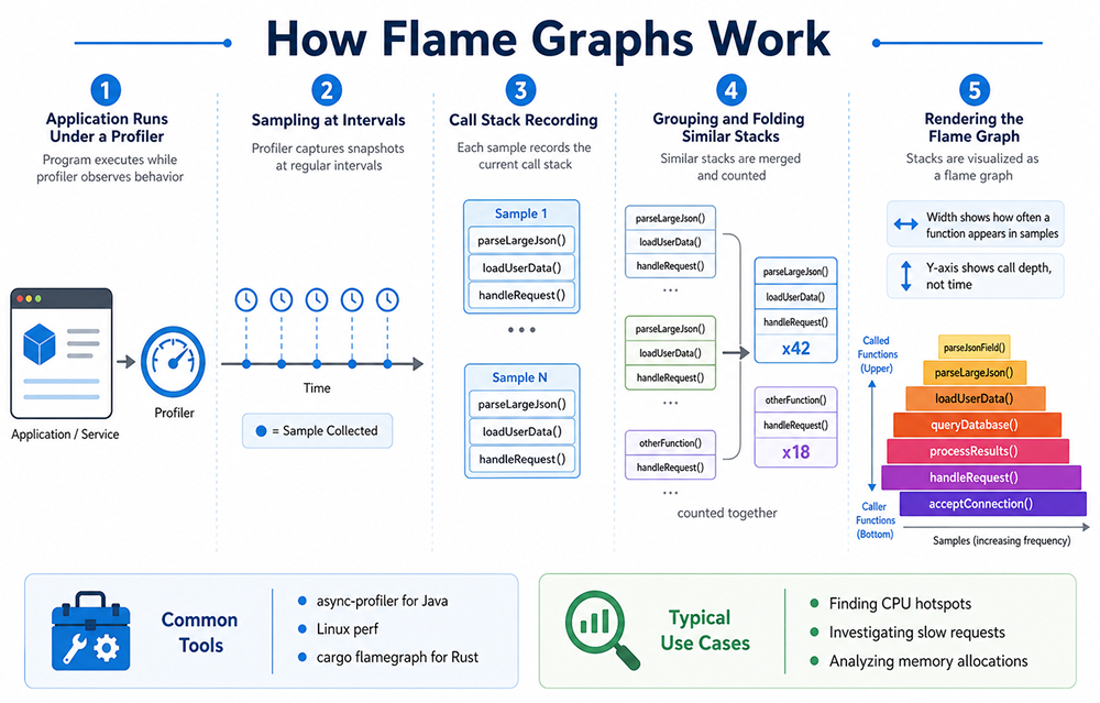
Imagine a web API endpoint that feels slow. The profiler may show that most samples pass through handleRequest(), loadUserData(), and then parseLargeJson(). If parseLargeJson() appears as a very wide block, you now have a strong clue. The problem may not be the whole endpoint. It may be an expensive parsing step. This is why flame graphs are useful. They reduce noise.
Instead of guessing, you follow the wide blocks. Start at the bottom, find the broadest path, and move upward. That path often leads to the hottest area of the application. Not always, but often enough to speed up the investigation.
For Java applications, it’s common to generate Java flame graphs with tools like async-profiler. This tool is especially handy for profiling CPU usage, memory allocation, lock events, and other runtime events, making it a natural choice for analyzing JVM performance issues.
When it comes to Rust, developers usually turn to tools built on Linux perf or the cargo-flamegraph workflow. The Rust flame graph crate is a way to generate flame graphs that is friendly to Cargo and built on the Inferno flame graph library.
Key Flame Graph Use Cases in Performance Optimization
Finding CPU Hotspots
The most common use case is CPU profiling. A flame graph helps answer a simple question: where is the CPU going?
This is useful when an application uses too much CPU, a background job takes too long, or a request handler becomes slower after a release. Instead of checking every function manually, you inspect the widest blocks first.
For example, you may discover that a small helper function is called millions of times. The function itself may look harmless. But inside a hot loop, even a small cost can become expensive.
Understanding Slow Requests
In distributed systems, one request may pass through several services. A flame chart or tracing-style flame view can show how long each service call took and where the delay happened. Datadog notes that flame graphs in distributed tracing can help teams connect traces with profiling data and identify bottlenecks across services.
This is especially helpful when no single service appears broken. Maybe the database is fast, the API is fine, and the cache is working. But the combination creates latency. A trace-based flame view can make that chain visible.
Investigating Memory Allocations
Flame graphs are not limited to CPU. Some profilers can generate allocation flame graphs. These show where memory is most often allocated.
This matters when garbage collection becomes expensive, memory usage grows over time, or a service allocates more than expected under load. In Java, allocation profiling can reveal object-heavy paths. In Rust, it can help expose unexpected heap allocations in code that was expected to be lightweight.
Comparing Before and After Optimization
A flame graph is also a good communication tool. You can capture one graph before a change and another after the fix. The difference is often easy to explain.
- Before: a wide block shows expensive JSON serialization.
- After: the block is much smaller.
That visual evidence helps during code reviews, incident reviews, and performance reports. It also prevents vague claims like “we optimized the service.” The graph shows what changed.
Final Thoughts
A flame graph is a practical way to understand where an application spends time. It turns profiling data into a visual map, helping developers quickly spot expensive functions, deep call paths, and repeated work that may slow the system down.
For Java, Rust, and other performance-sensitive applications, flame graphs make optimization easier to explain and act on. They do not solve the issue directly, but they show where to look first, which is often the hardest part of performance debugging.