
Omer Grinboim
Mar 16, 2026
Intro
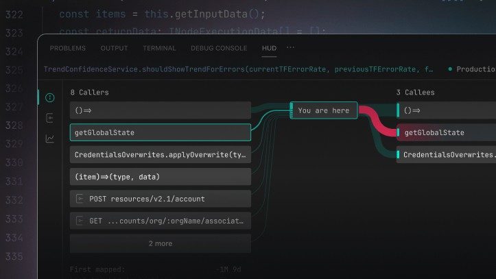
Every engineer knows how code is written, but almost none truly see how it flows in production – Hud’s Snaky Chart changes that.a
We started Hud’s Snaky Chart as an internal term that somehow caught on, and now it’s one of our most powerful features. But the story behind it reveals a fundamental problem in software engineering that we had to solve.
A key aspect of understanding how code behaves in production is understanding the flows of functions calling other functions. It might sound simple, but getting this data in real-time is surprisingly complex.
We discovered three major obstacles:
You can’t just use code analysis tools like xref-they return 10 times as many callers as there are in reality. Static analysis shows you what *could* call a function, not what *actually* calls it in production.
You can’t grab many stack traces in production because it will harm performance. Even if you could, in dynamic languages like JavaScript, the asynchronous nature breaks the context of the stack trace. The call stack becomes meaningless when you have async operations, promises, and callbacks
Even if you could overcome the data collection challenges, you still need to visualize the diversity and discrepancies of how that function behaves:
We knew that for AI agents to be able to generate production-grade code, we had to solve this deep problem. Agents need to understand not just the syntax and structure of code, but how it behaves in the real world.
The major challenge was building a low-level, highly efficient solution to gather this data from production without using stack traces and with negligible effect on performance. Then we had to find a way to visualize it in a meaningful way.
We went with a variable width, dual tone Sankey chart-a visualization that can show in one image:
The chart shows the “flow” of function calls as actual flows, with the width representing frequency and color coding representing error states. It’s like having a real-time map of your code’s behavior in production.
The real power of the Snaky Chart is that it enables an entirely new way of navigating code. You and your AI agent can now explore the codebase with full awareness of how functions actually behave in production.
This is production-driven code navigation, and we love it. Instead of guessing about function relationships, you can see exactly how your code flows in the real world.
The Snaky Chart transforms how engineers understand their codebase. You can now:
Some people felt the Sankey chart looked a bit “snakey” with its flowing lines and curves, and the term stuck. But the Snaky Chart isn’t just a cool visual-it’s integrated directly into your IDE for every function.
—
Ready to navigate your code with production reality? The Snaky Chart brings the full context of your application’s behavior directly into your IDE.


